Full Images and Detail Views of the Backside
The Process
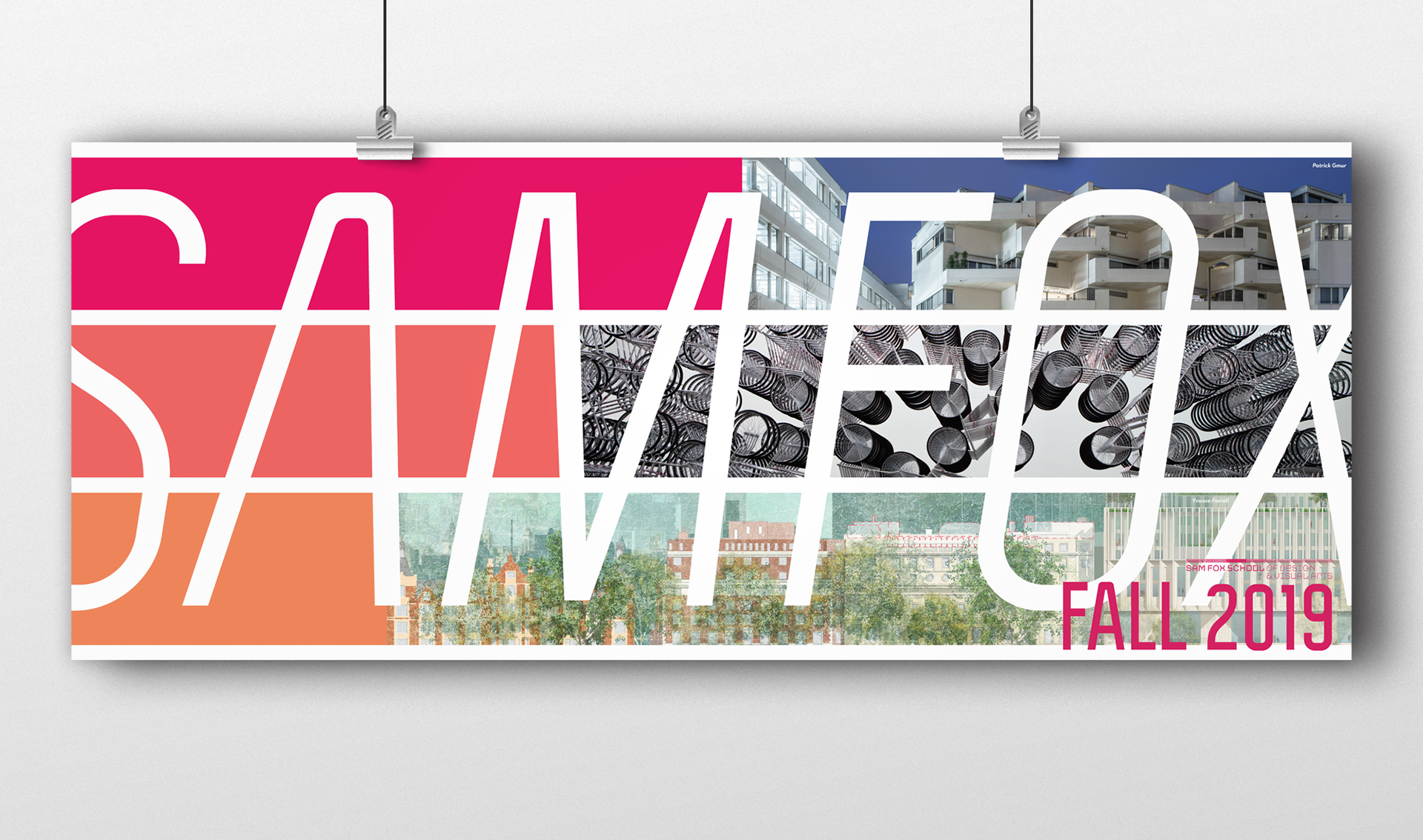
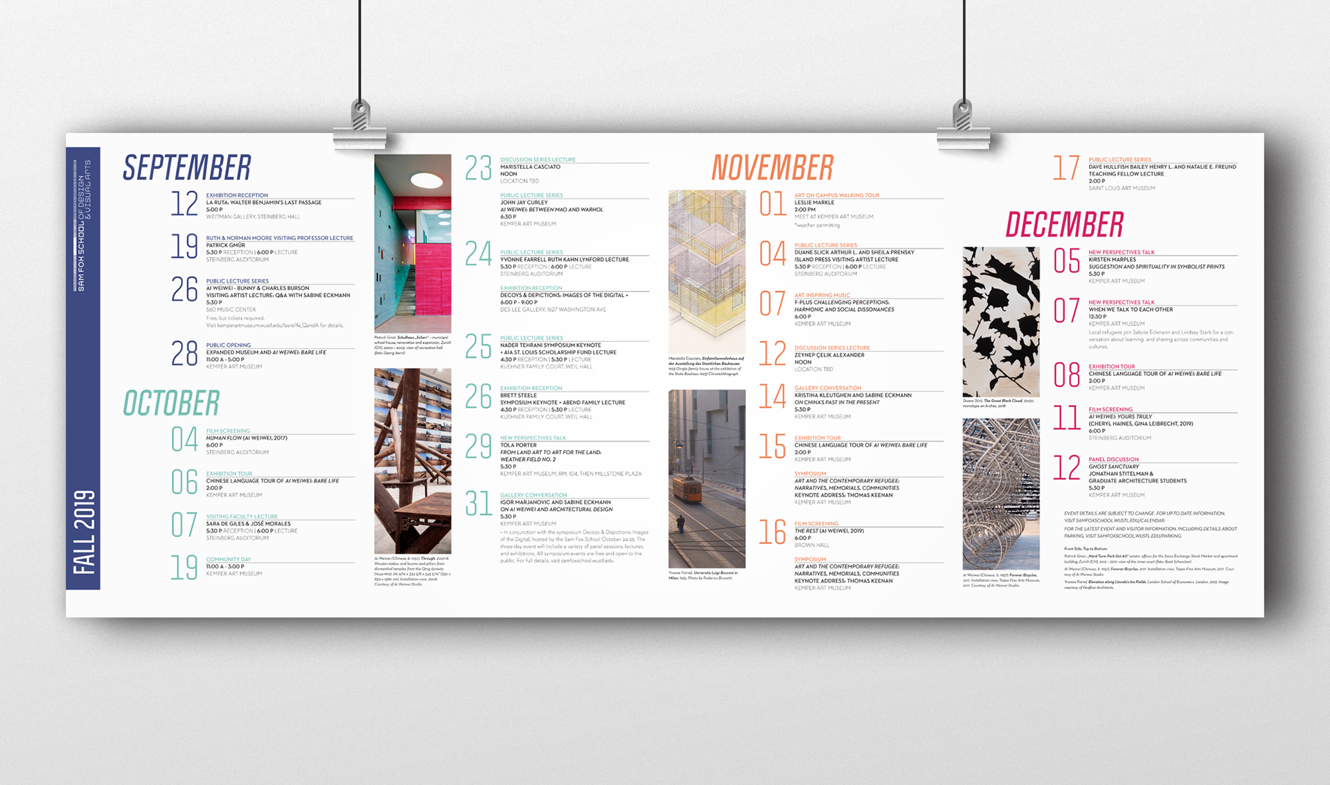
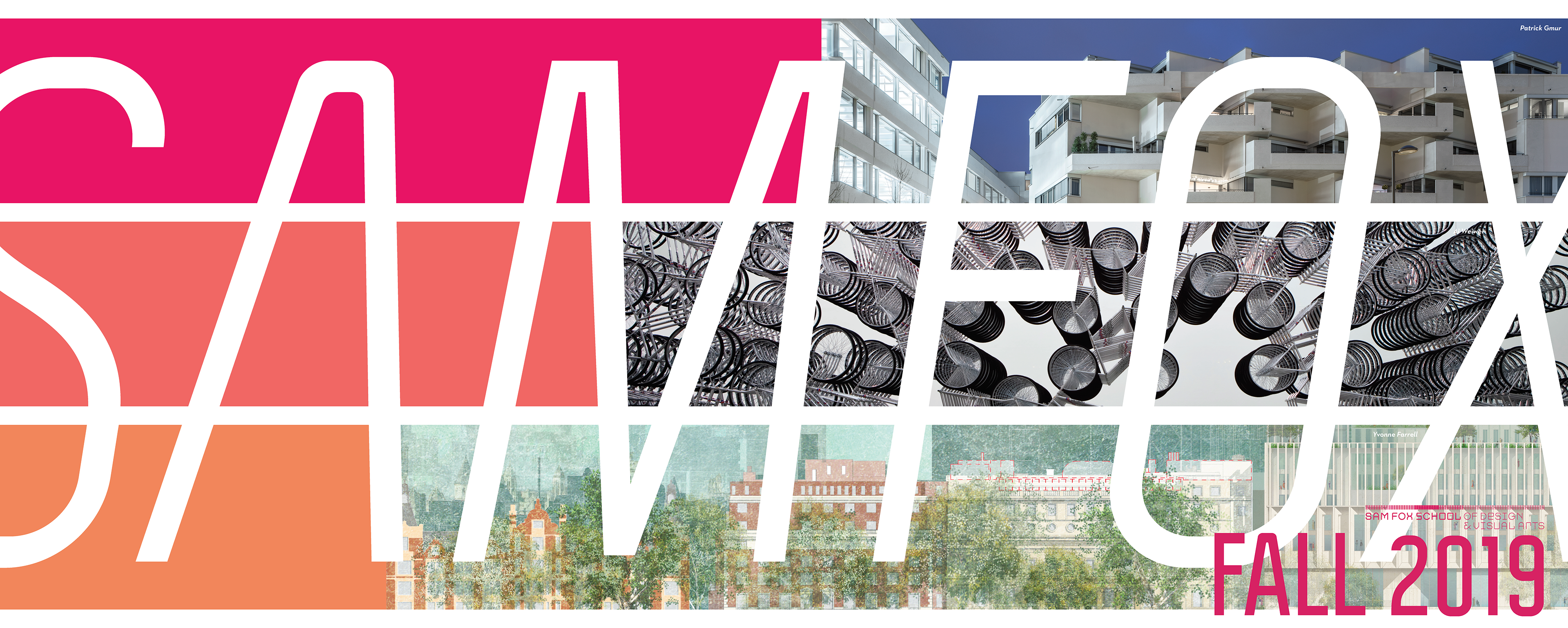
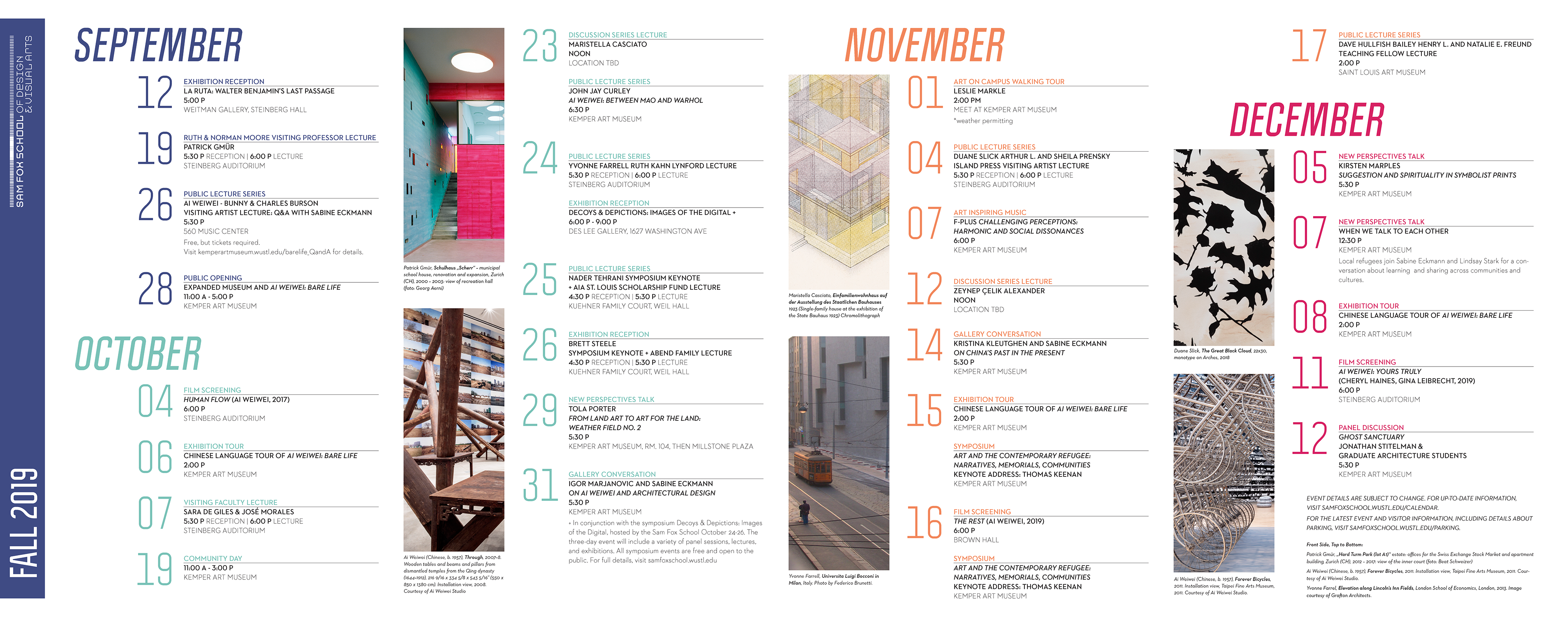
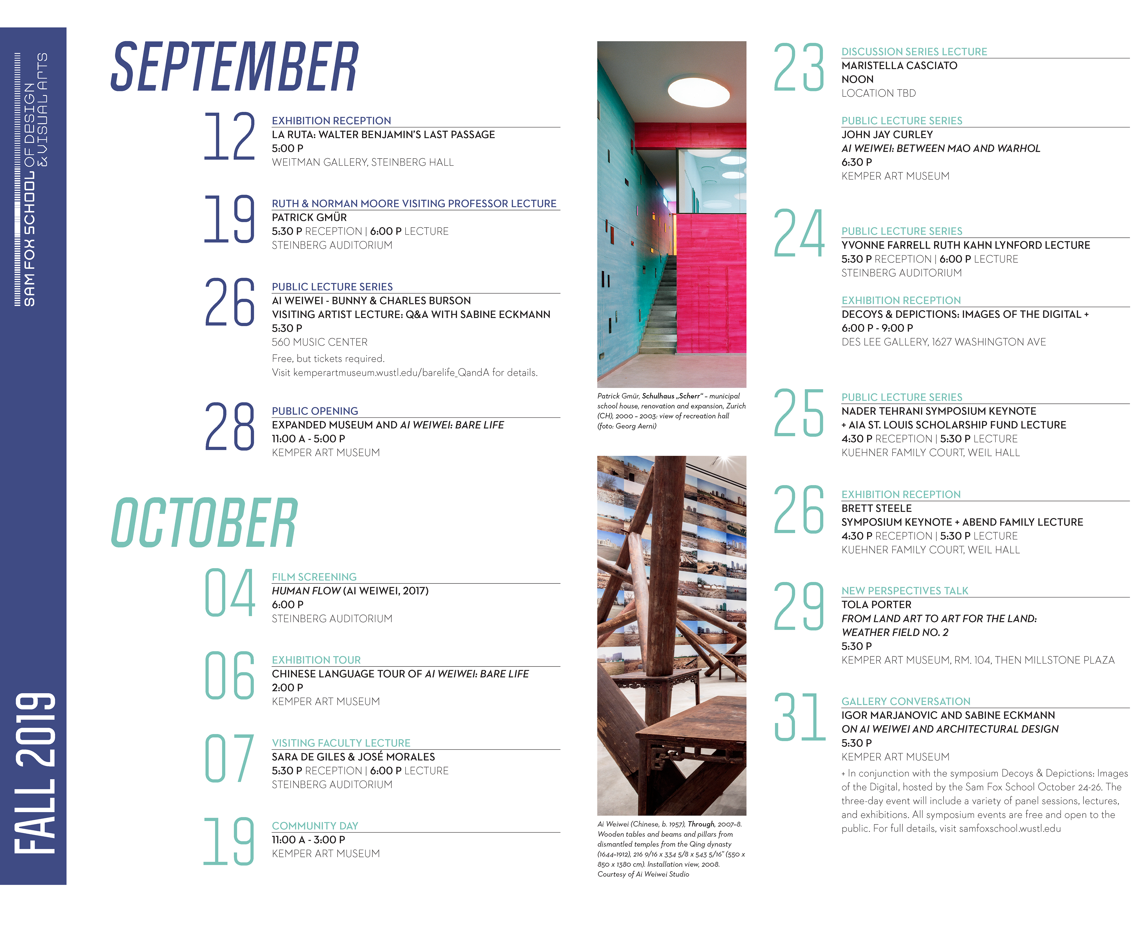
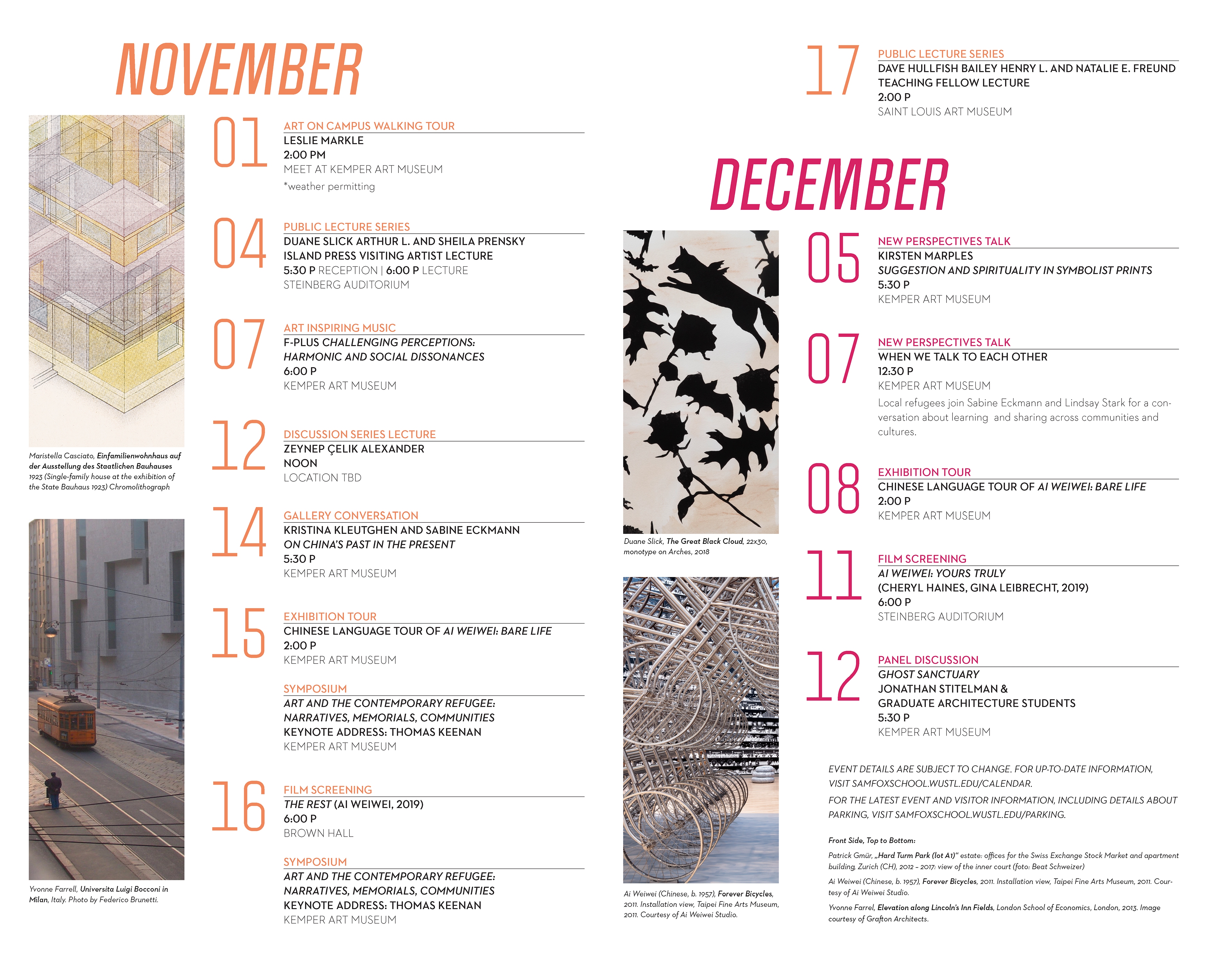
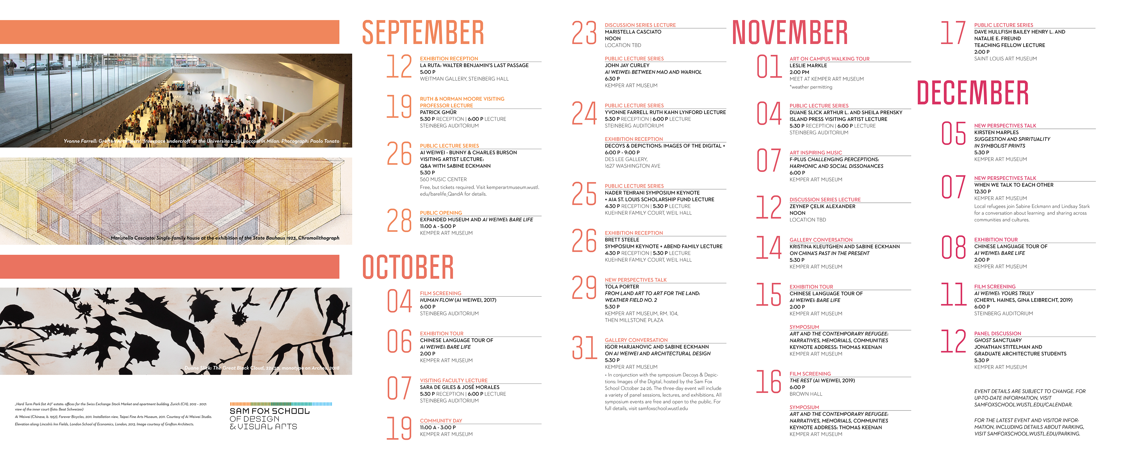
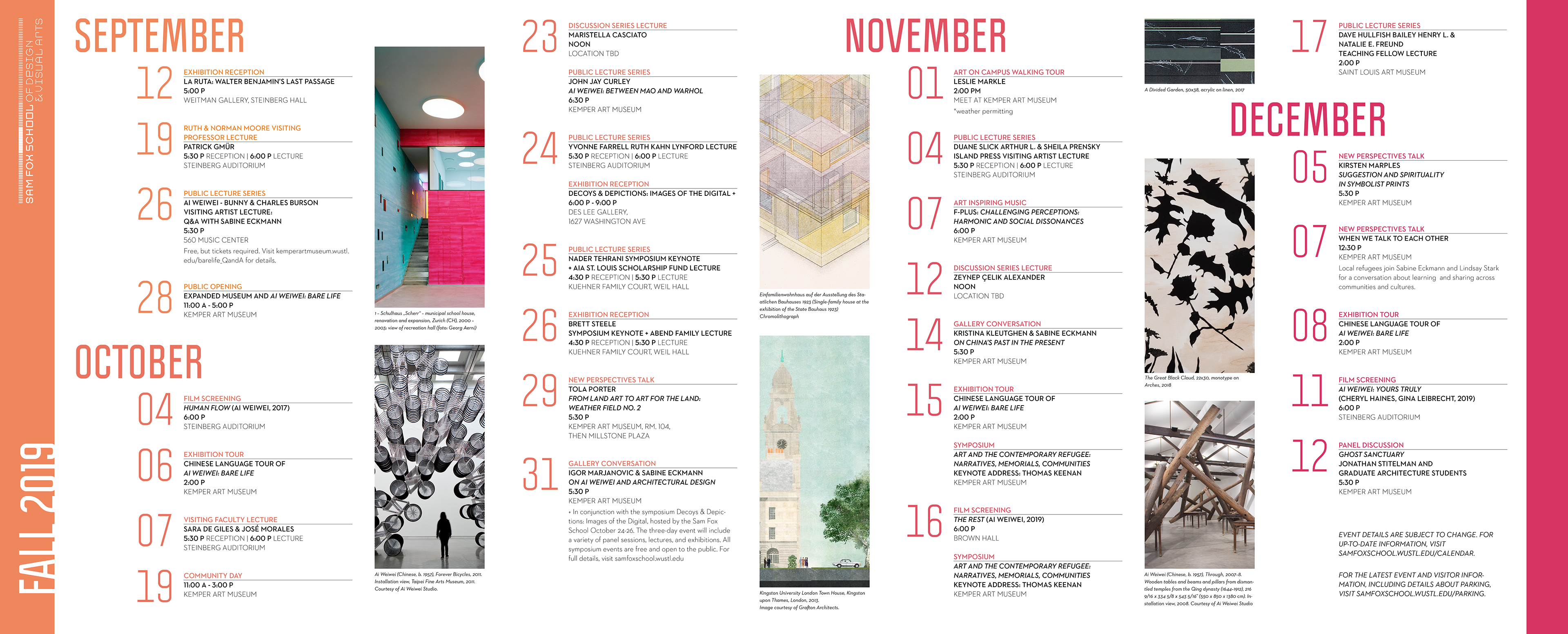
The prompt for this project was to design an events calendar for the Sam Fox School of Design & Visual Arts Fall 2019 Semester. The calendar must function as both an easily understandable source of information (the backside) as well as an eye-catching advertisement to call attention to the school's programming (the frontside).
The biggest challenge for this assignment was in arranging elements of drastically varying sizes in terms of contents in an orderly fashion. I also learned to create a system of organization for content that I didn't have control over (i.e. some events did not include a select location, or had a dedicated host/lecturer).
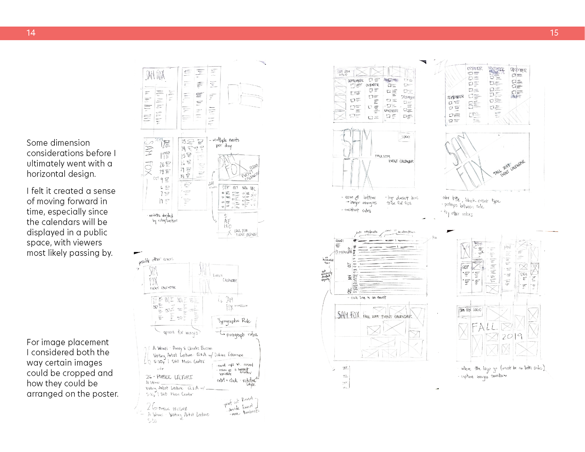
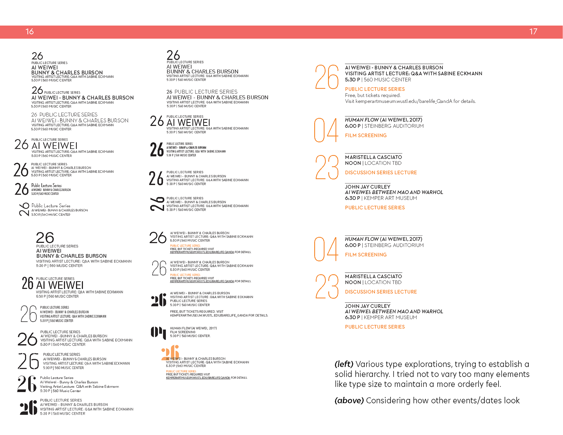
When integrating images with my decided system for organizing text, I tried to keep things consistent between the backside and frontside. If the backside had vertically cropped images, the frontside would also mainly feature vertically cropped images, and vice versa. Eventually it was pointed out to me that in doing this I was forcibly placing a limit on myself, especially when there were other ways to unify the front and back (like with the italicized text).
With each iteration I also aimed to explore how far I could push the scale shifts of the text on the cover, to make the biggest statement I possibly could.
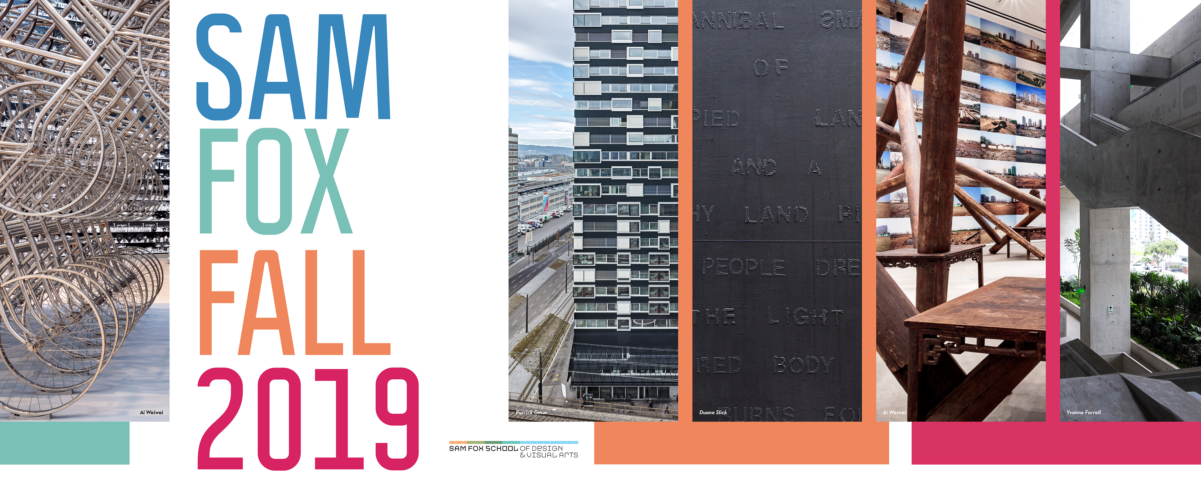
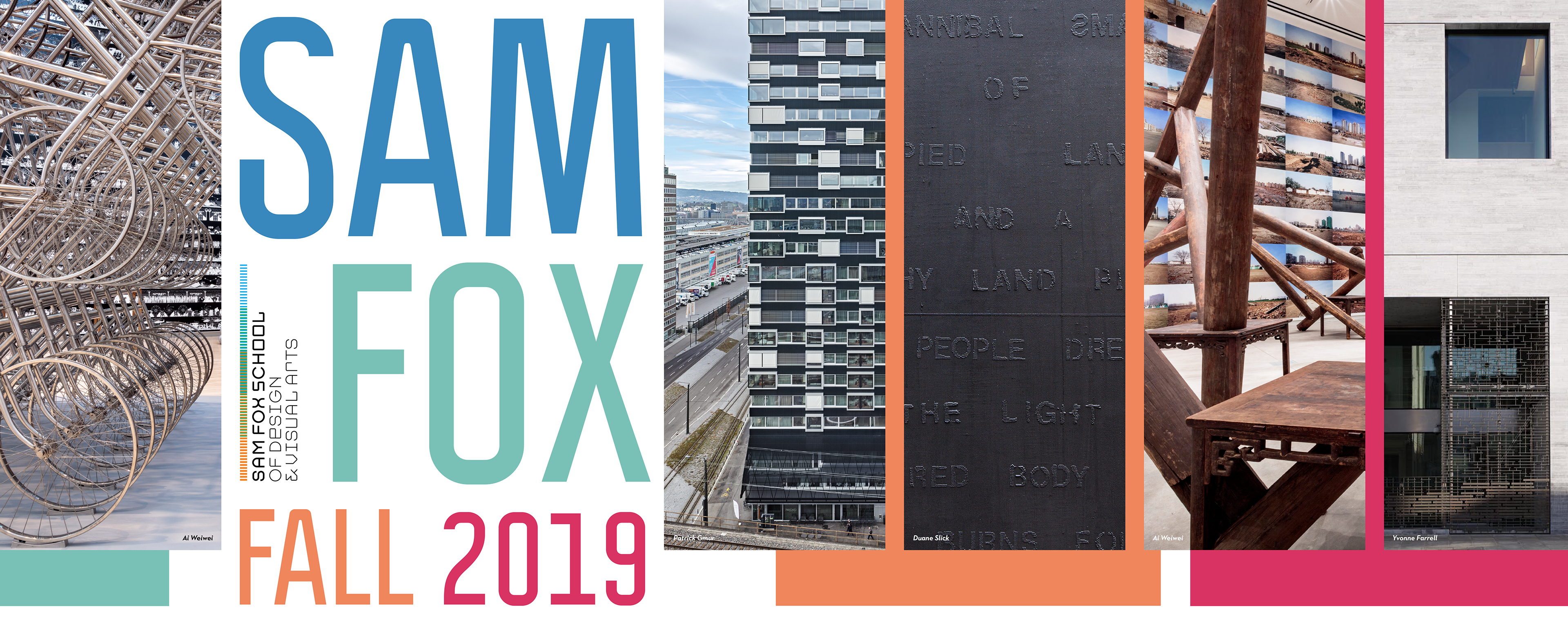
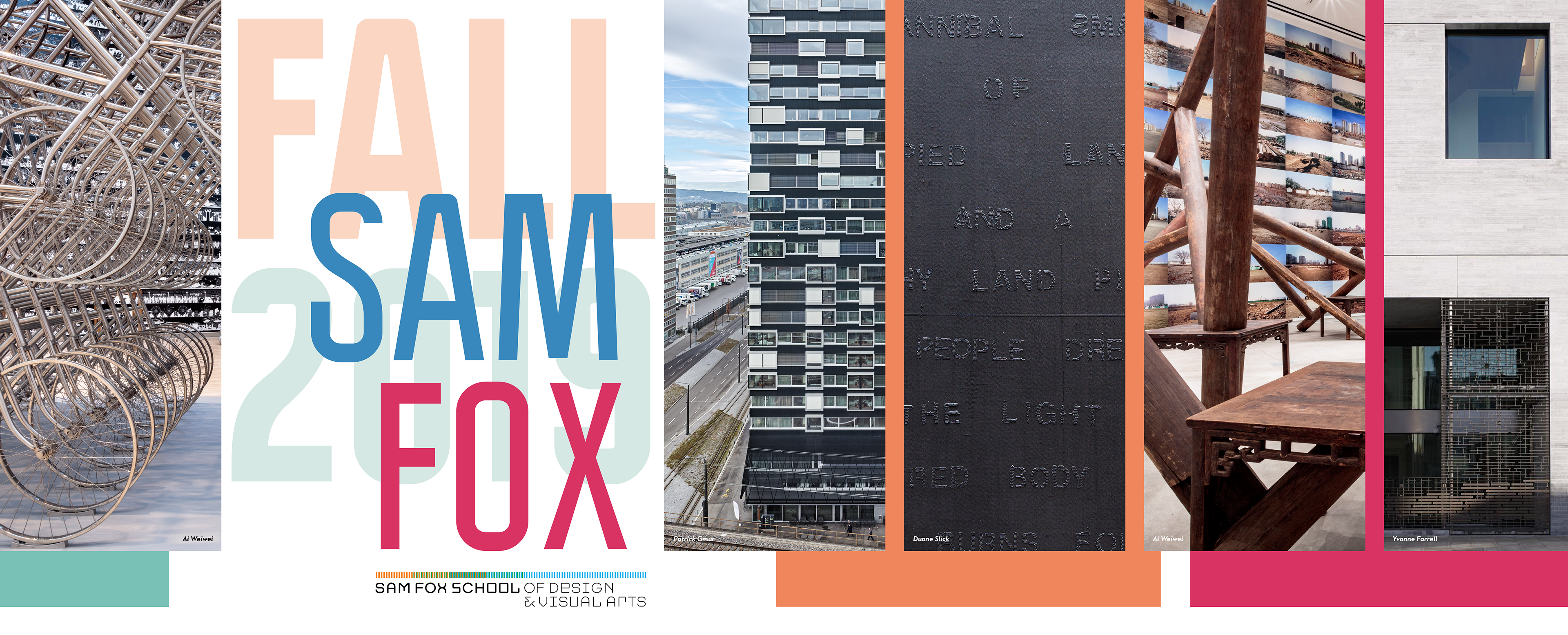
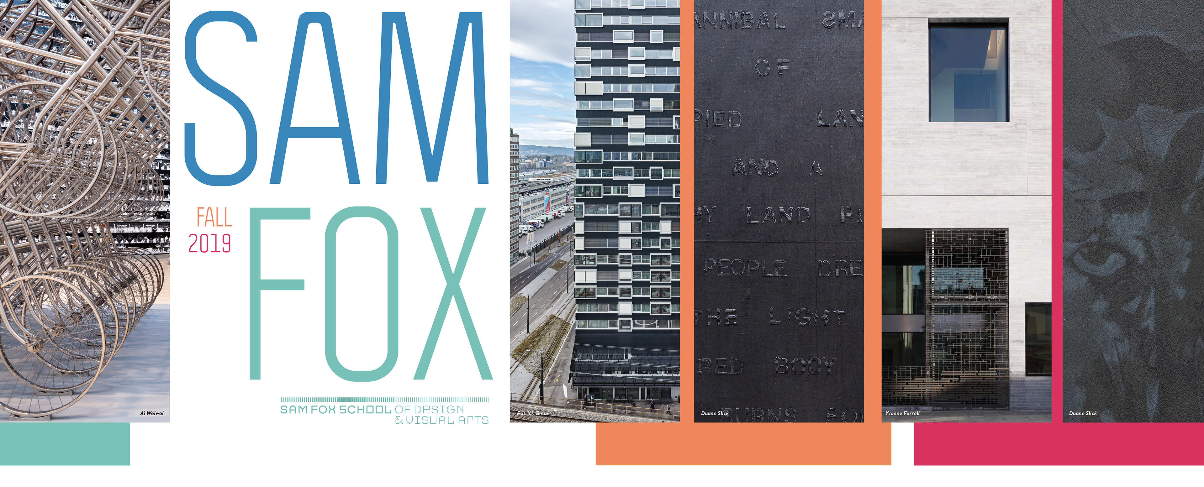
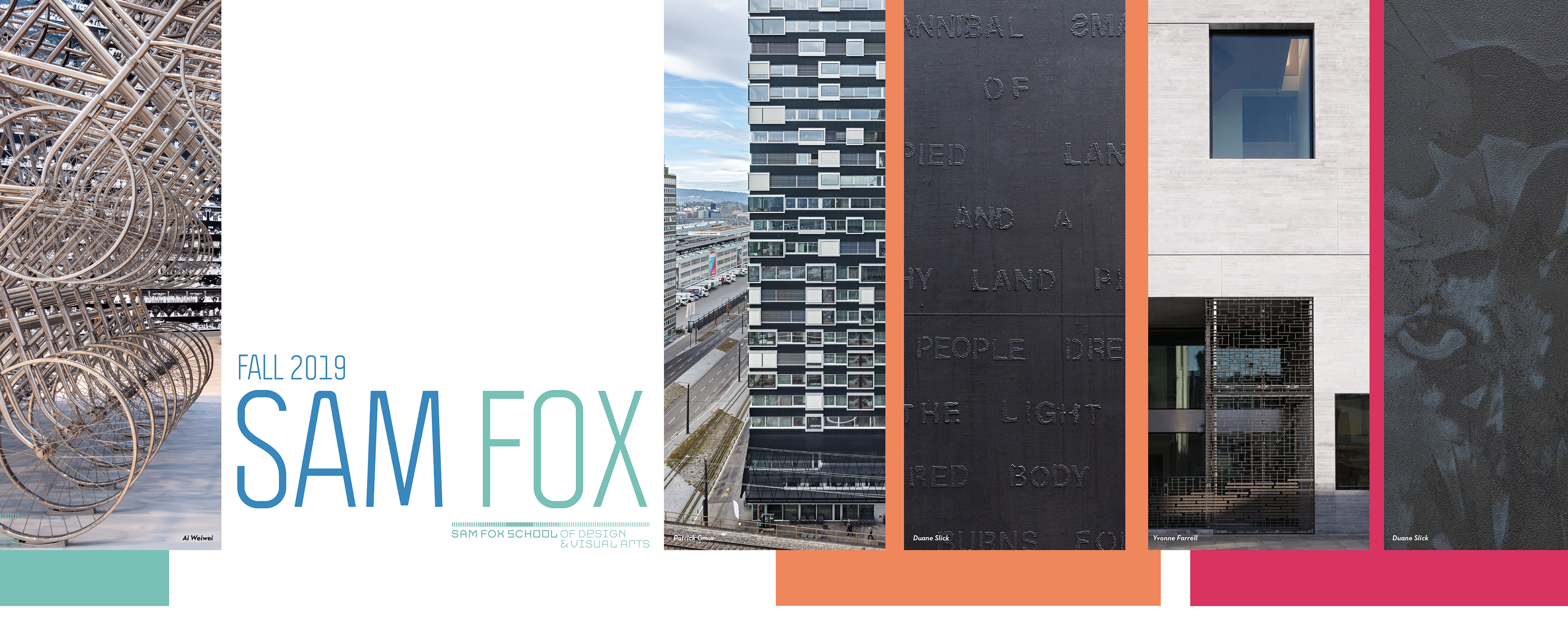
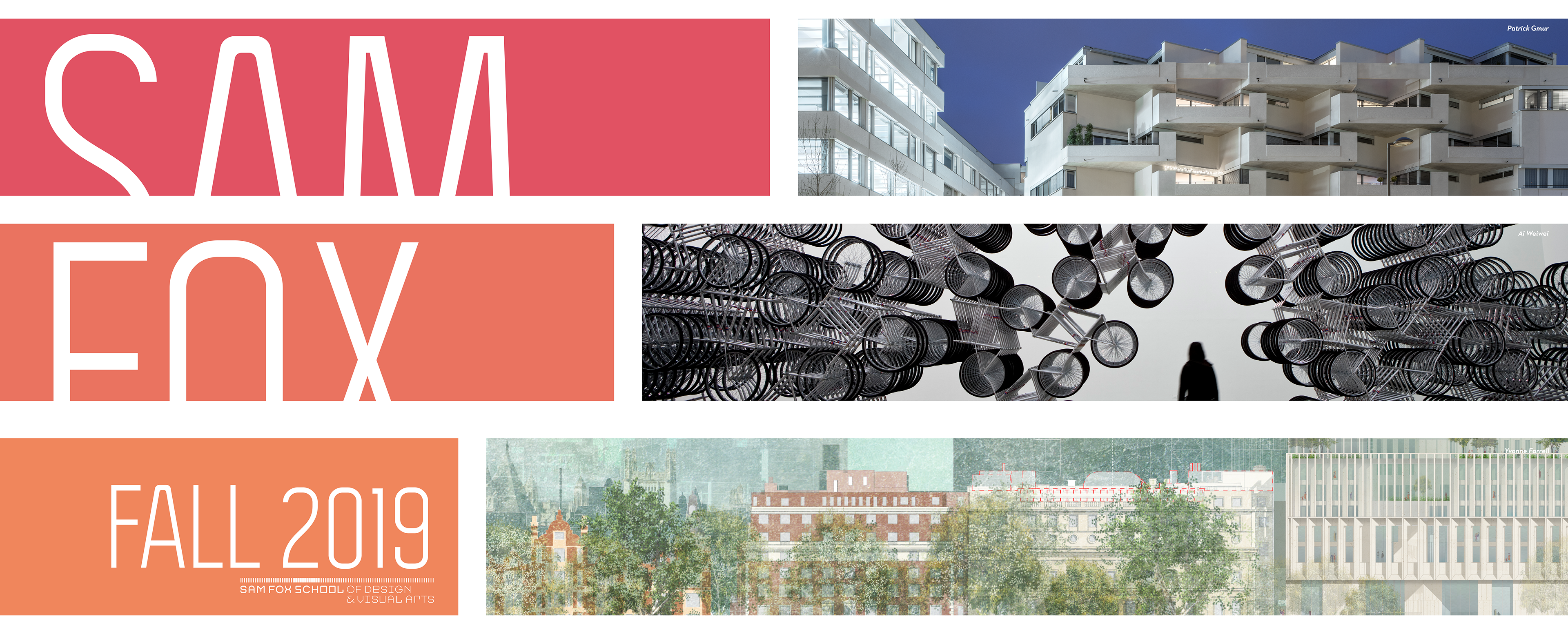
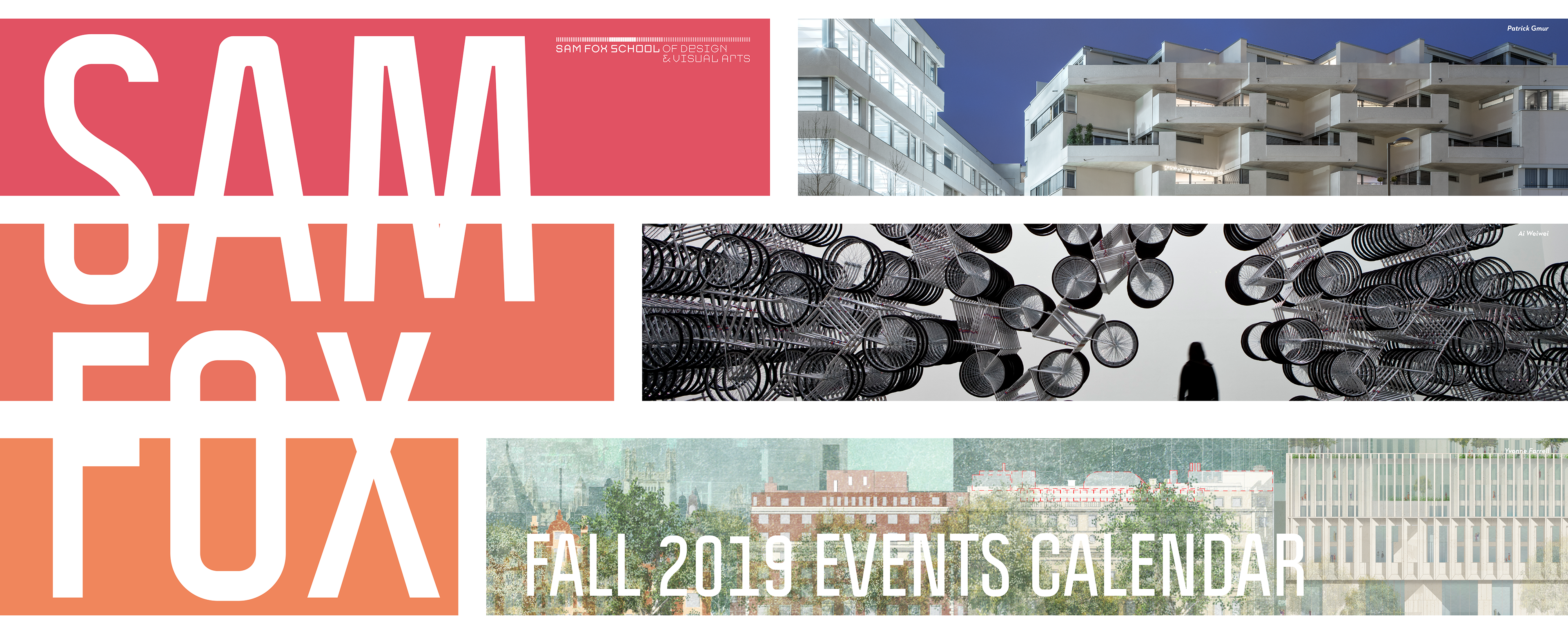
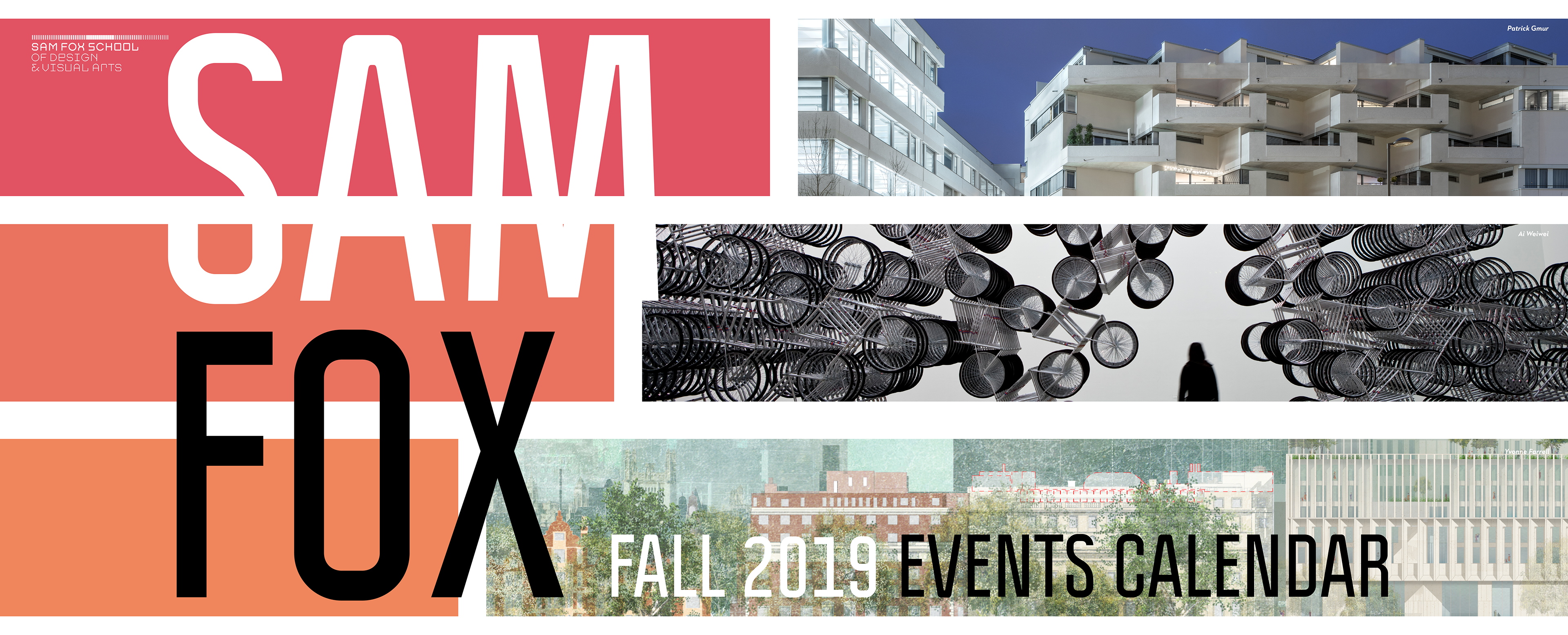
Color palette used was the official Sam Fox School color palette.