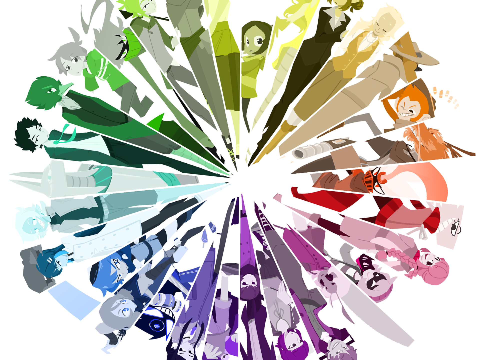
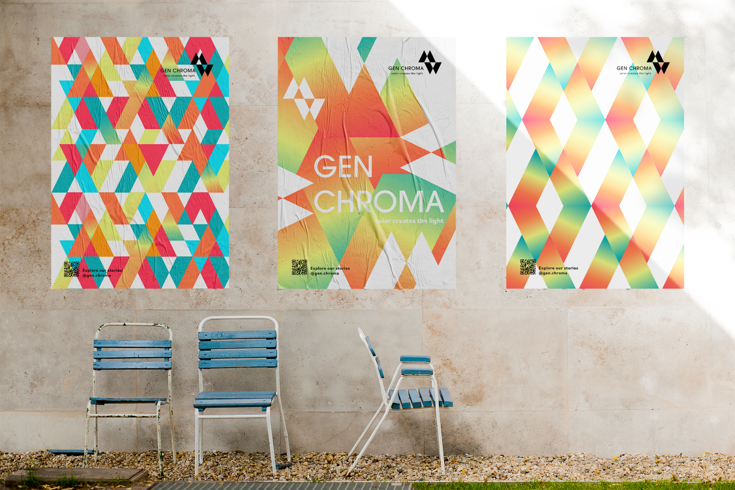
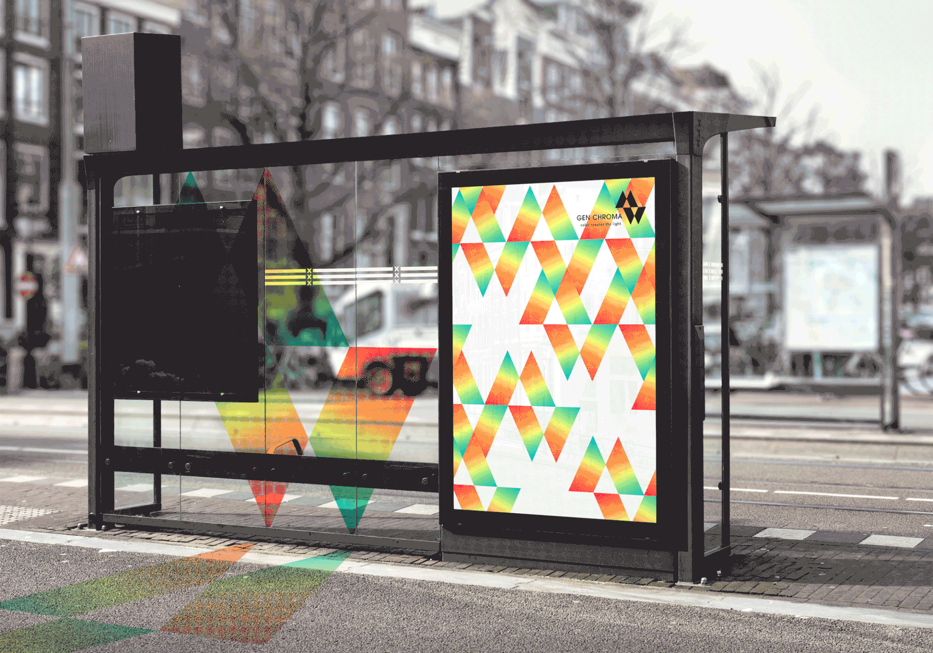
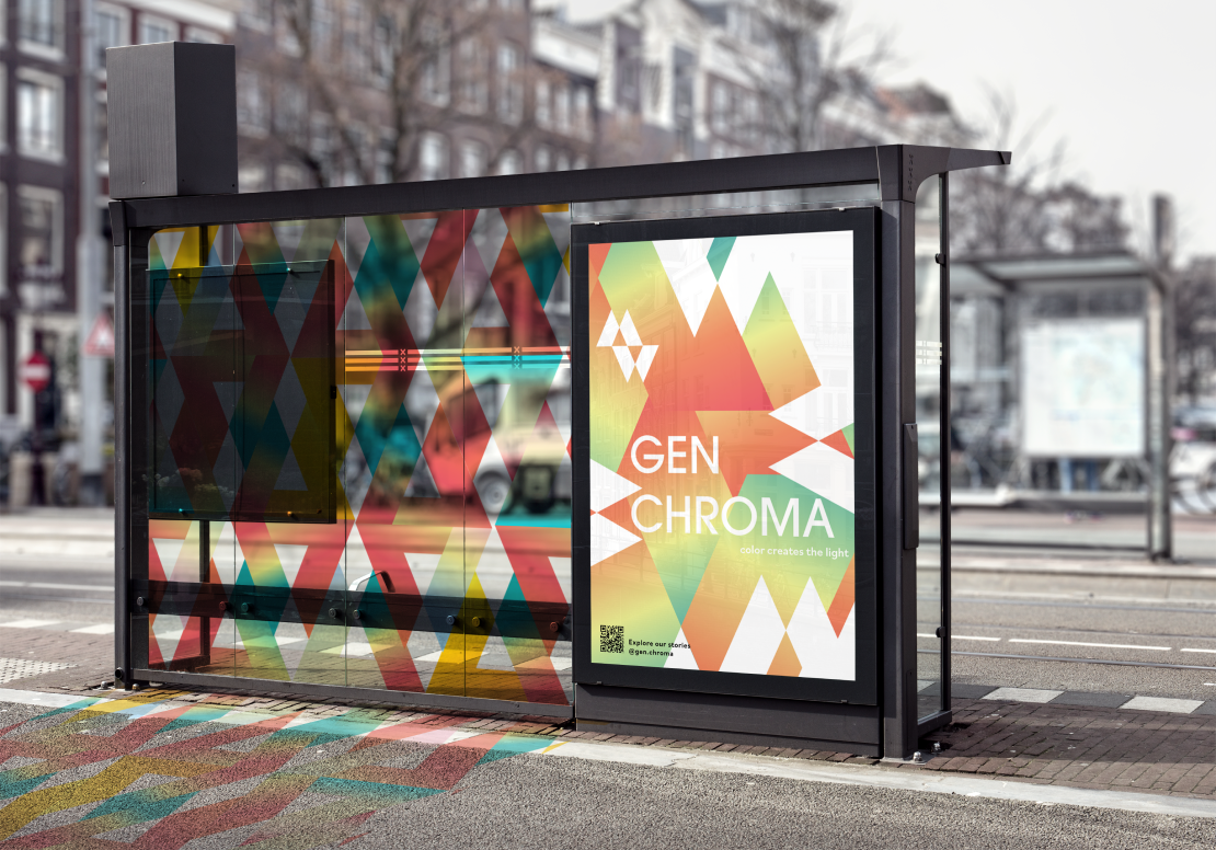
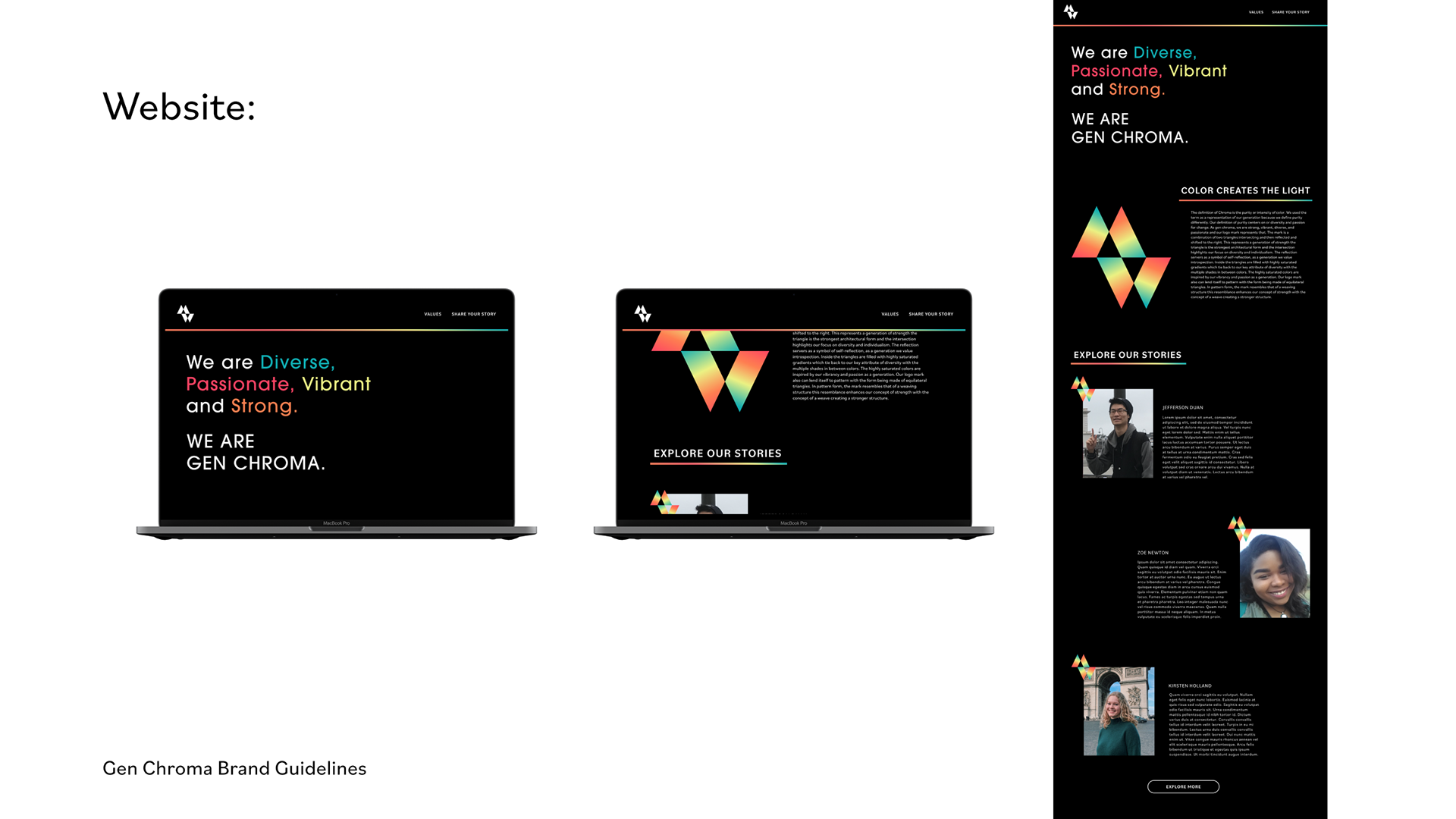
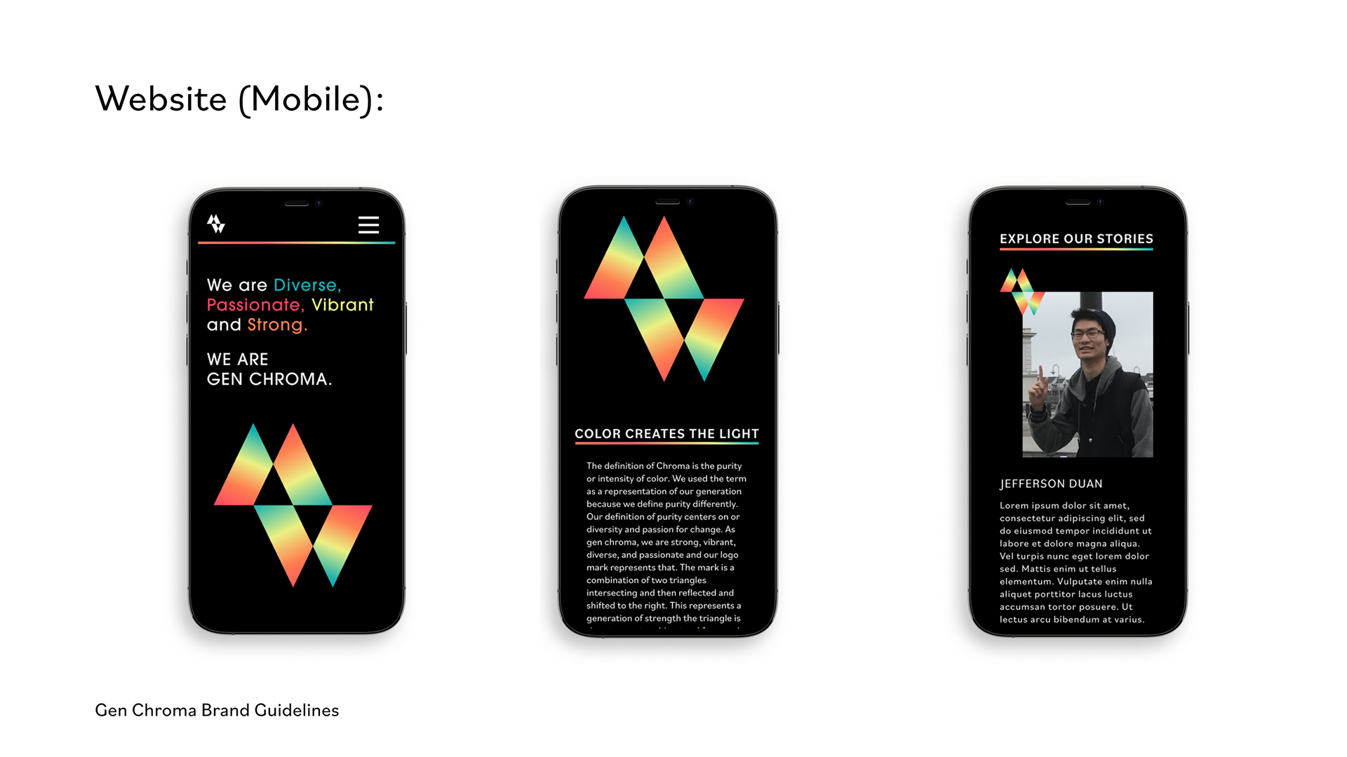
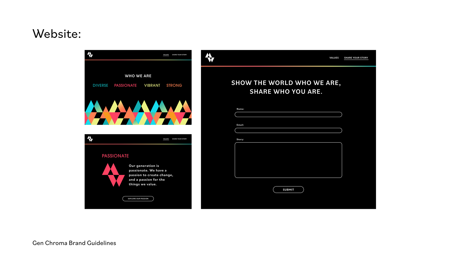
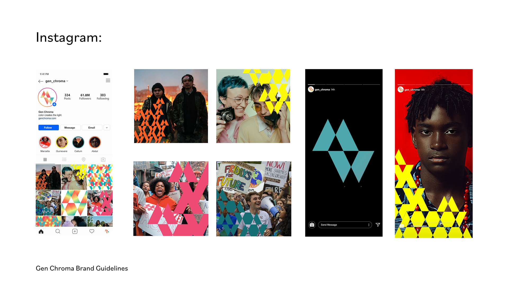
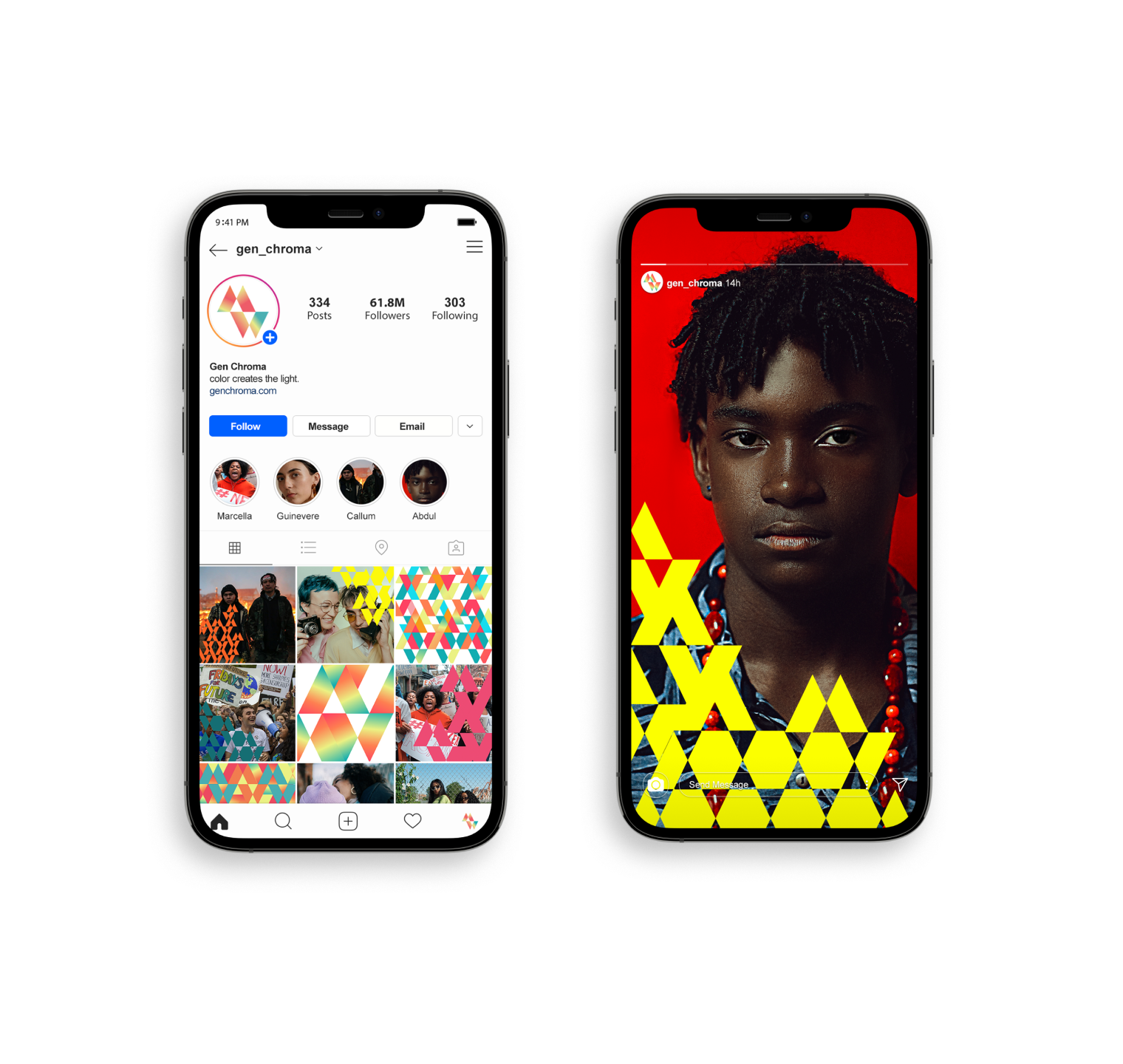
Gen Chroma is a mock brand identity dedicated to highlighting the strength, diversity, and passion of a generation defined by an era of rapid and constant change, created by Zoe Newton, Kirsten Holland, Cheryl Kao, and Yours Truly. Inspired by the motifs of prisms refracting light into a vibrant spectrum of changing colors, and how casting light can change our perception of things, Gen Chroma's branding applications aim to provide members of Generation Z with avenues to express themselves and share their stories of vibrance, strength, diversity, and passion.


The Process
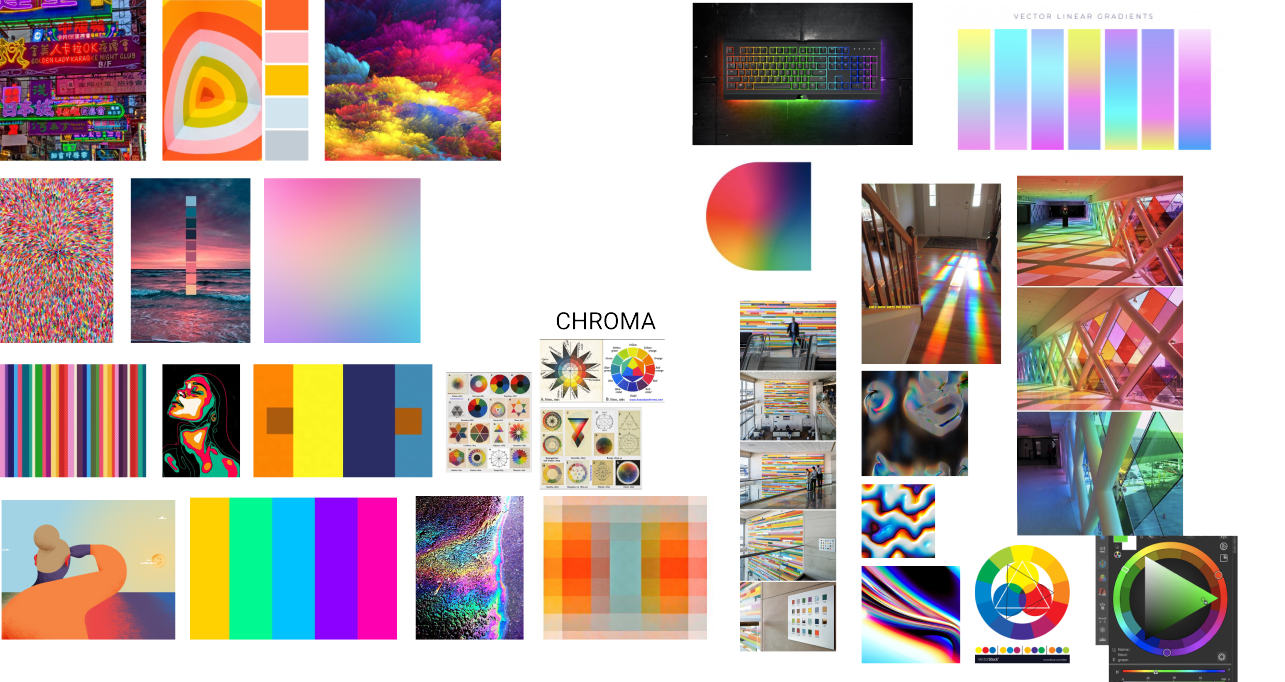
After deciding as a team to define our generation, we each pitched ideas for possible brand identities. We chose the motif of a gradated color spectrum and the concept of casting light to represent the vibrant and diverse social views of our generation. As such, we decided upon the word Chroma as our brand name, referring to the intensity of color.
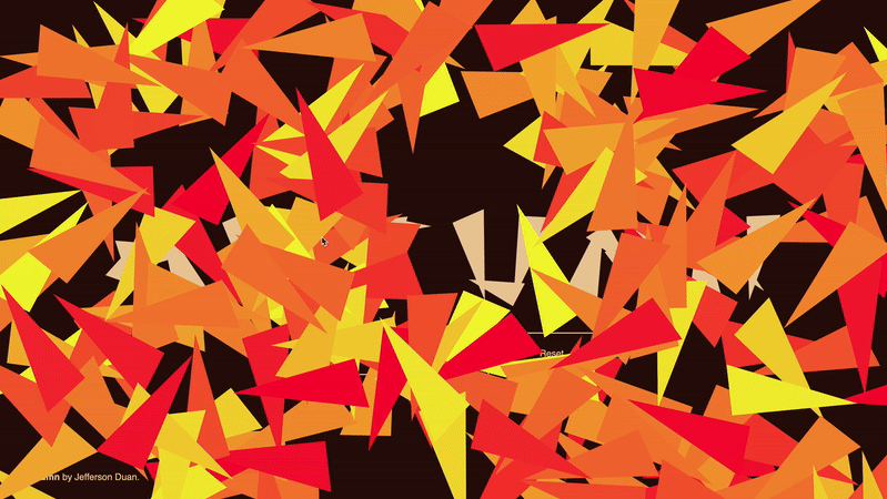
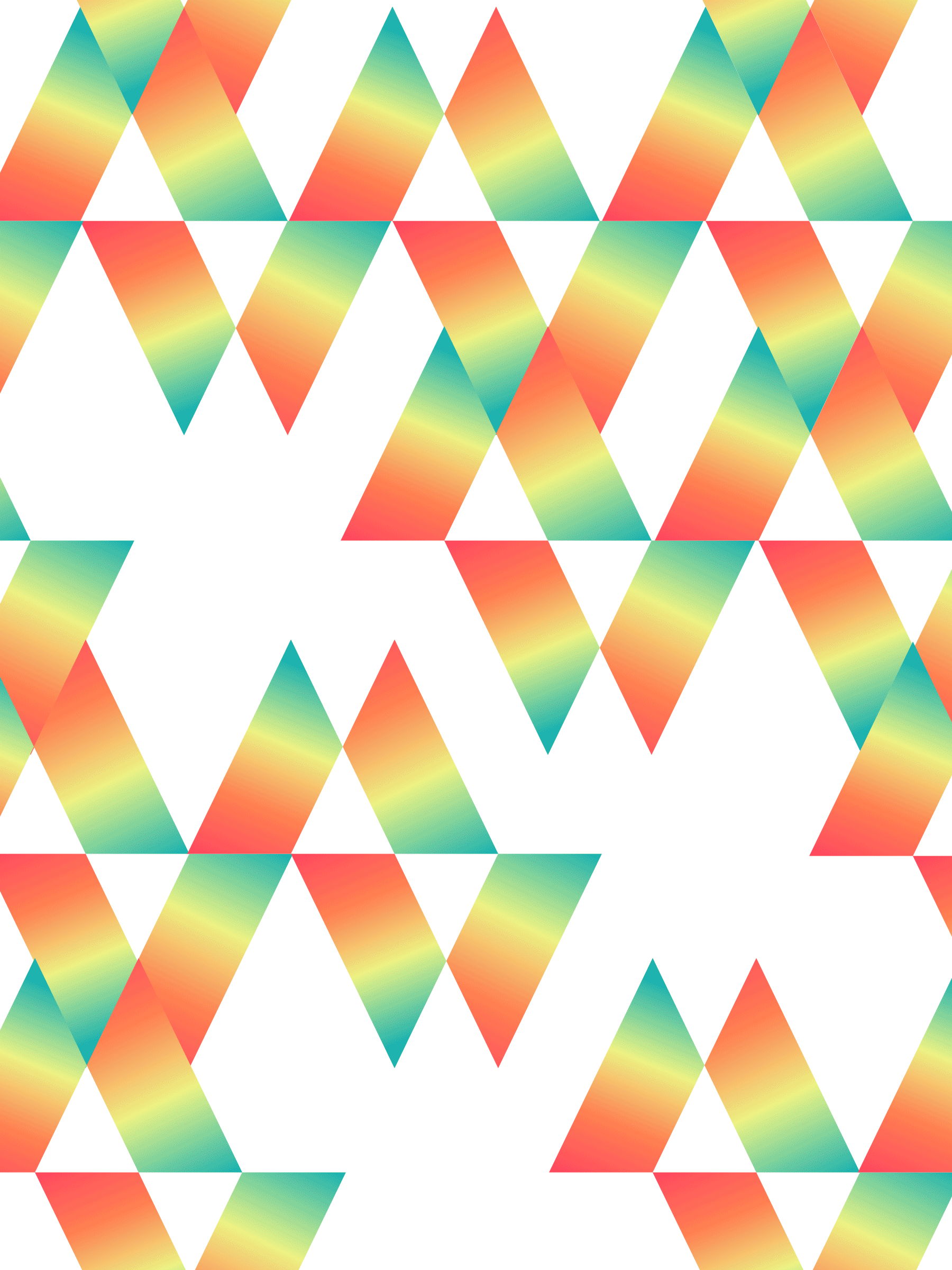
We also pitched ideas for our logomark, and eventually decided on my idea of choosing the shape of a prism. The prism's ability to refract white light into the full color spectrum reflects how our generation can be defined as one that brings new perceptions to traditional viewpoints. The geometric shape of a prism also lends itself well to communicating a sense of strength. Cheryl would later improve upon this design with the idea of two colored prisms overlapping each other to represent refracted light and combined strength. We also experimented with pattern-making to further emphasize this strength that comes with combined structure.
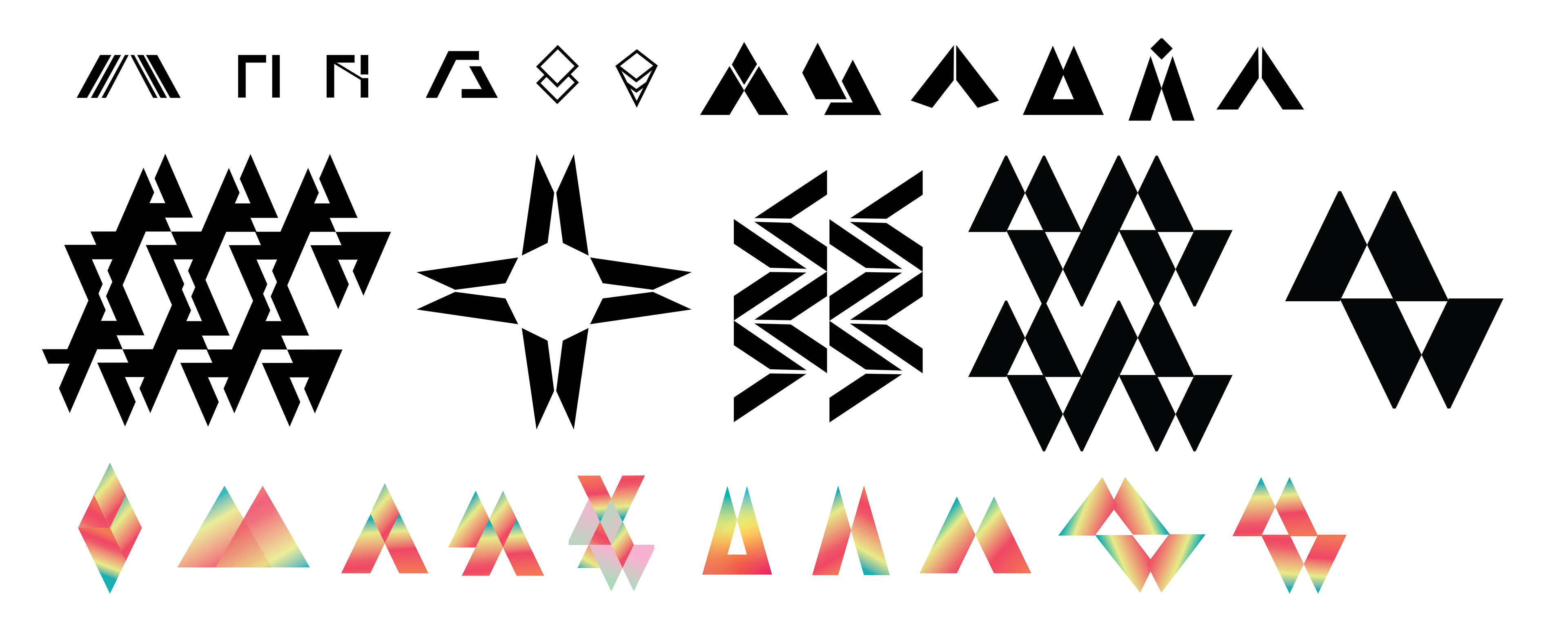
Cheryl and I largely handled the motion aspects of our brand. To make it clear that our logo was the result of converging prisms that overlapped to 'refract light', we wanted the logo to animate as such: four colorful triangles that came together to form a stronger more unique whole.