The Process
The premise for this project was relatively straightforward: create a short book based on a provided text, with the only limit being a maximum of three hue-scales.
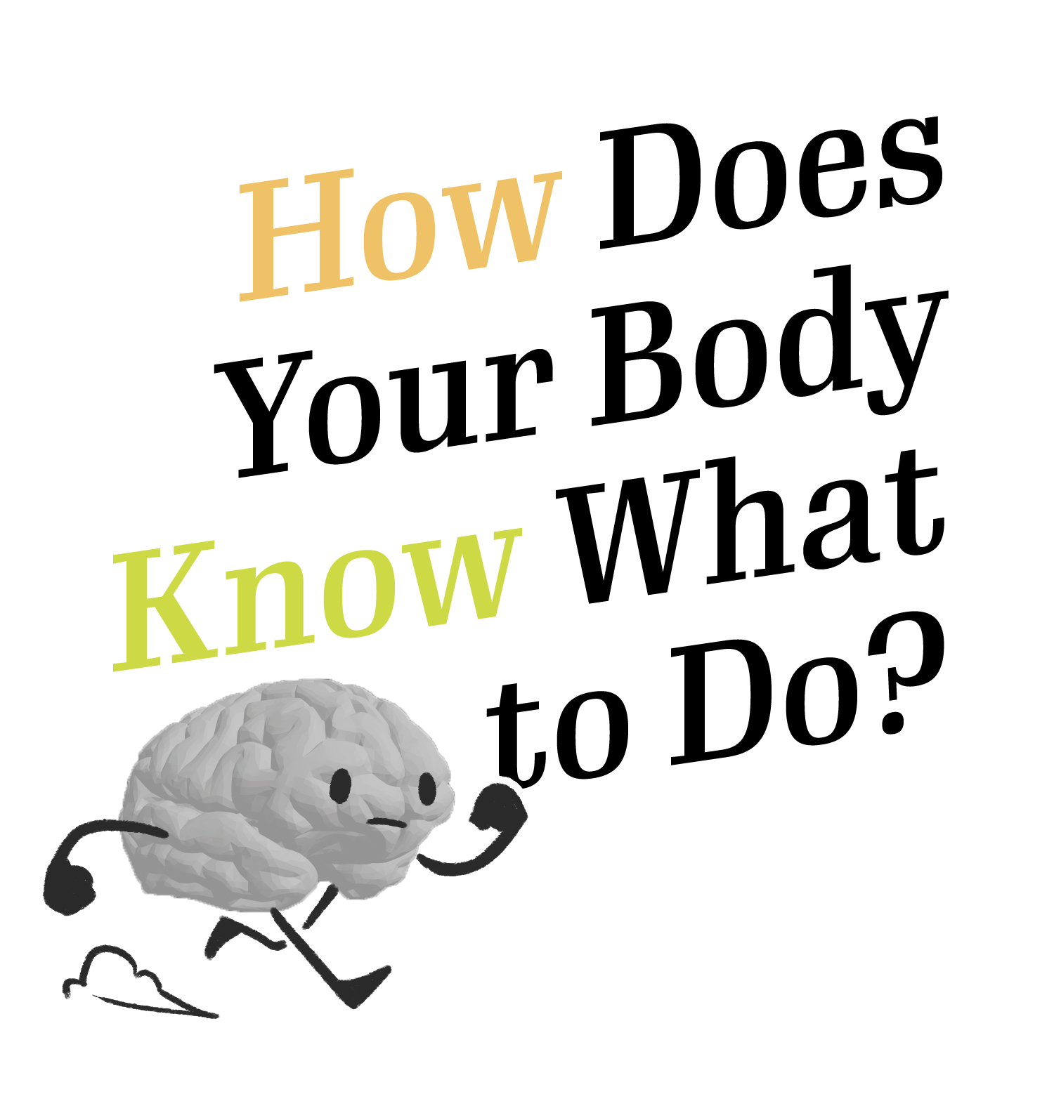
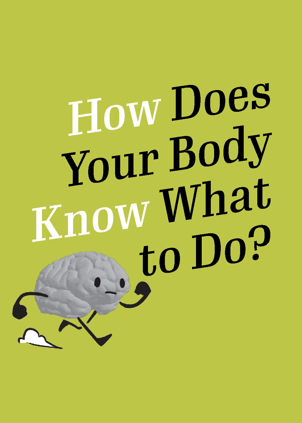
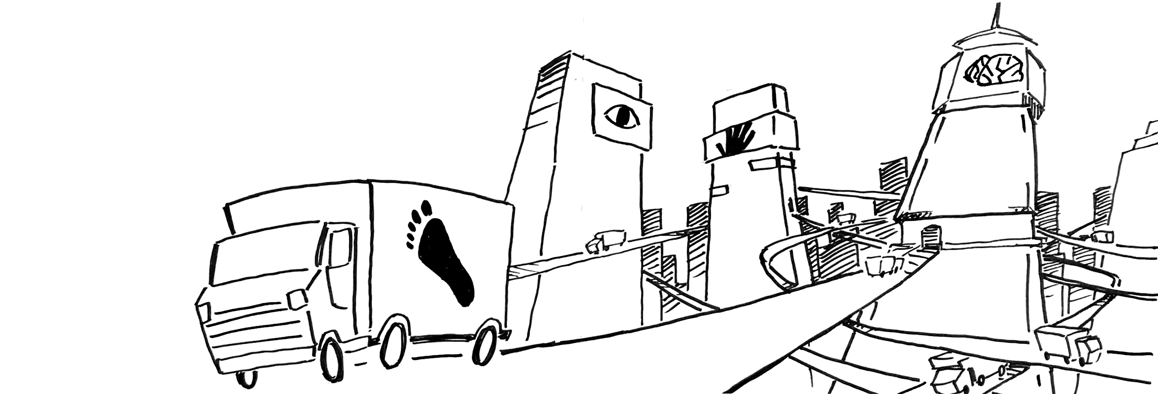
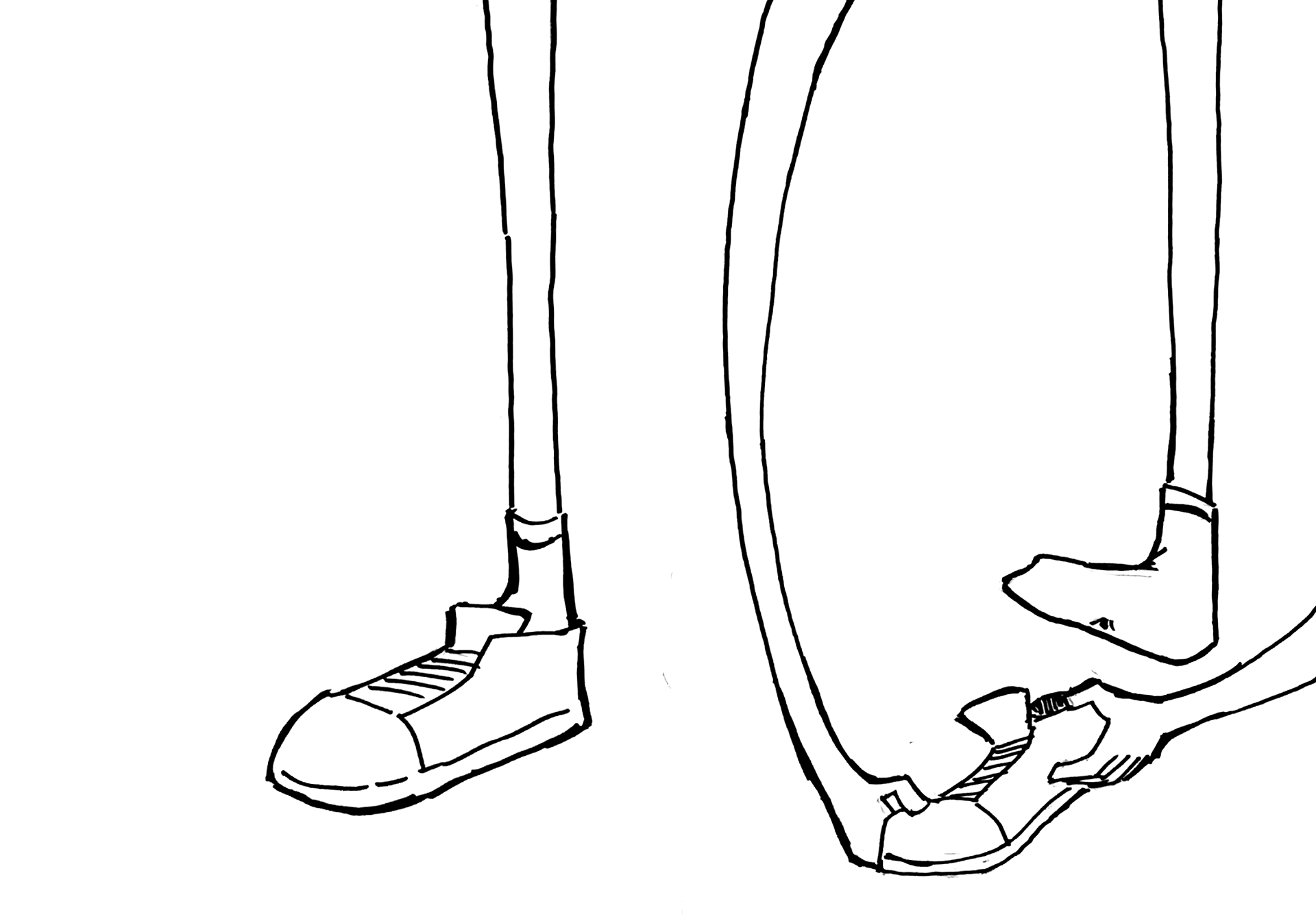
While not explicitly prompted, from the outset I wanted to present my text in a storybook fashion. I began exploring ways I could personify the body parts and the nervous system they send signals upon.
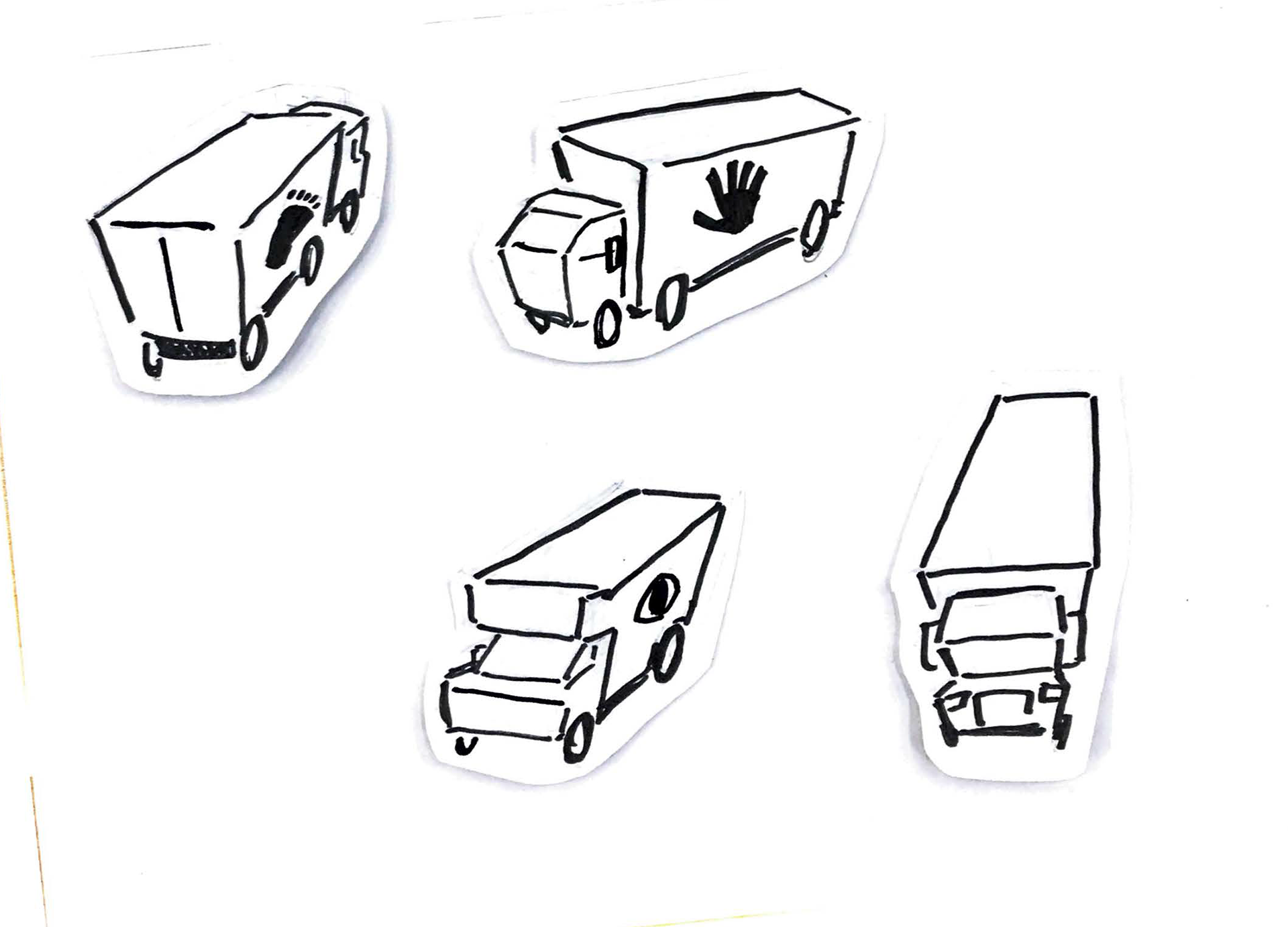
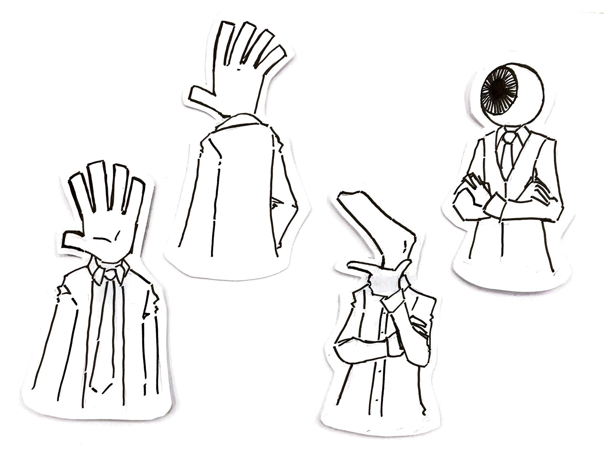
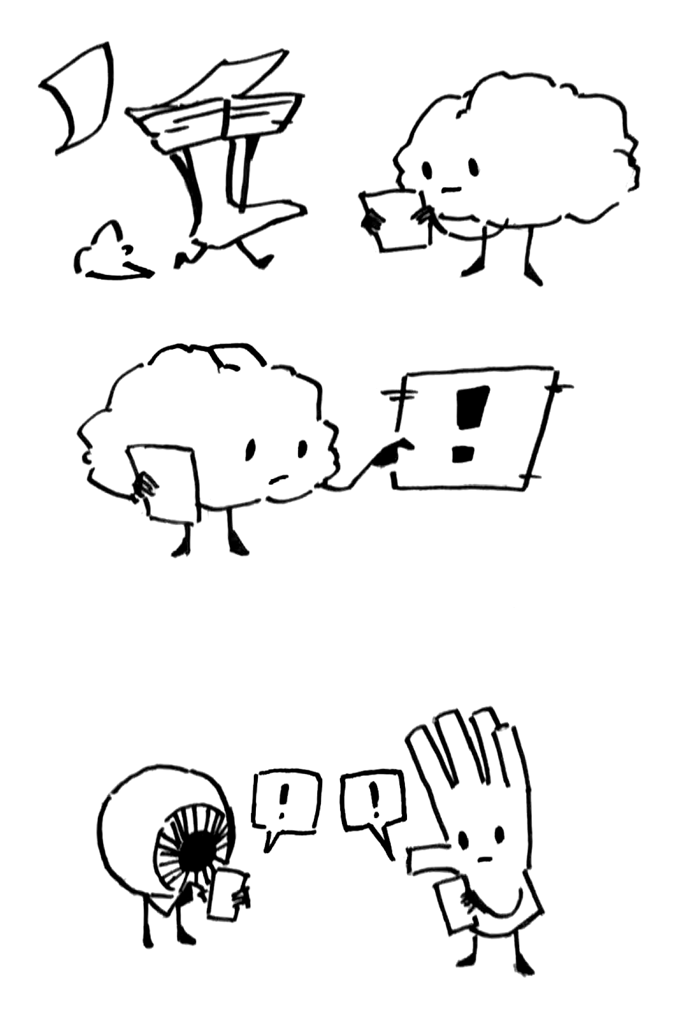
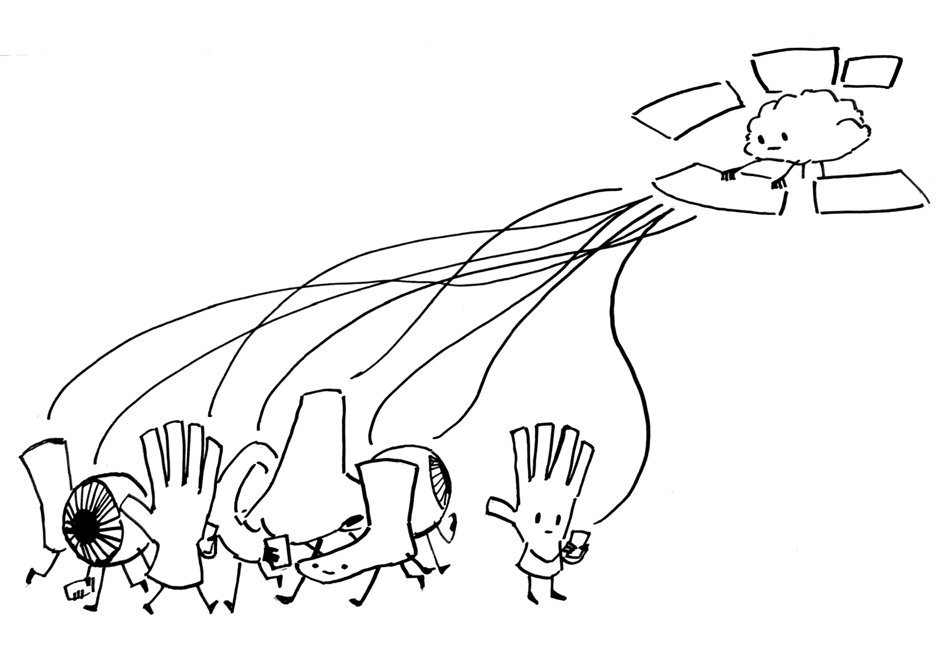
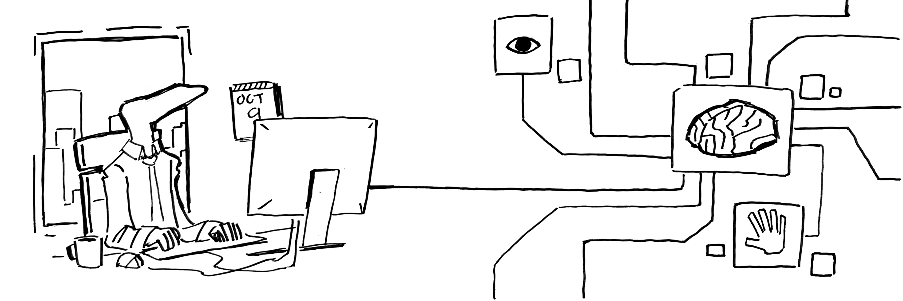
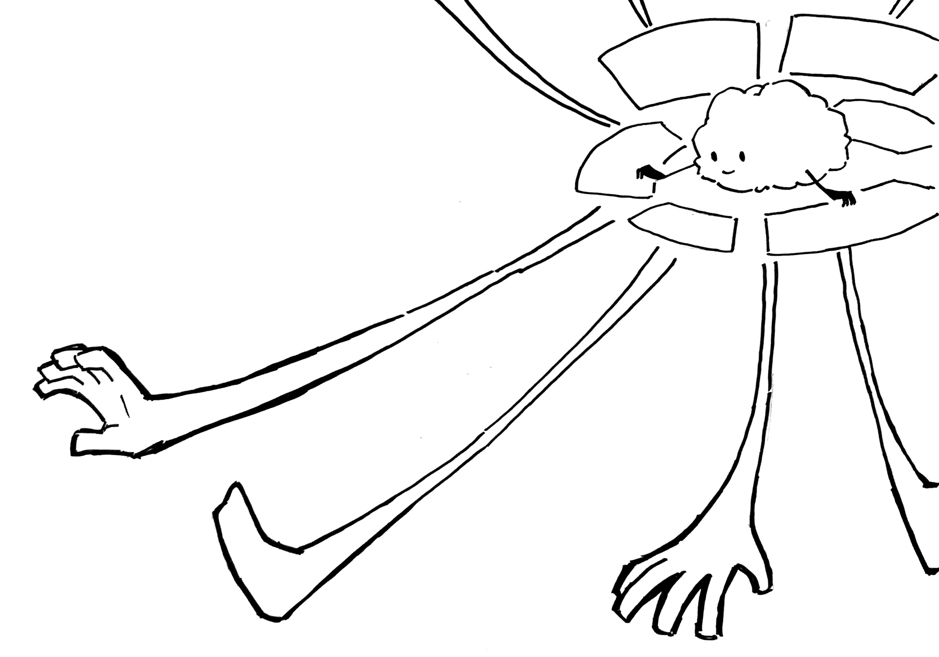
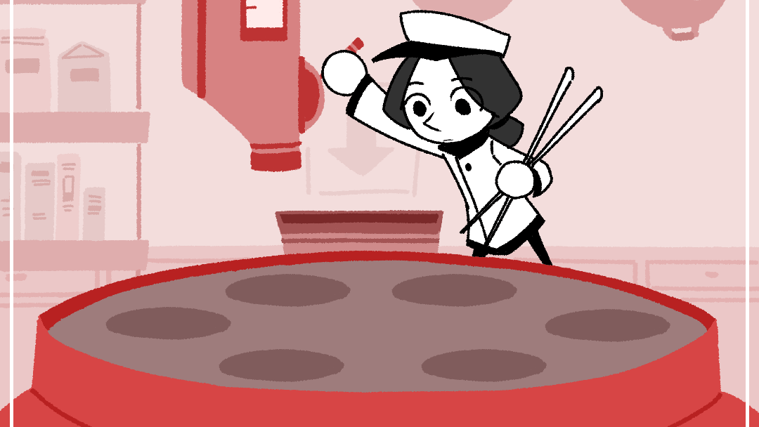
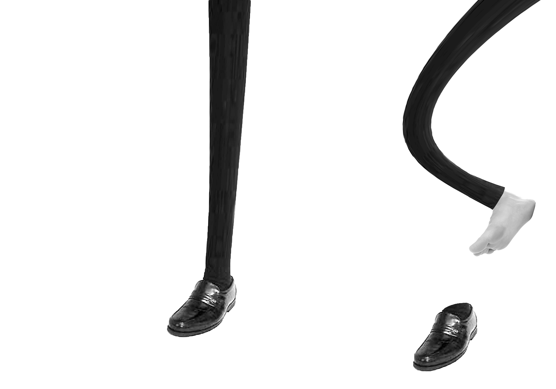
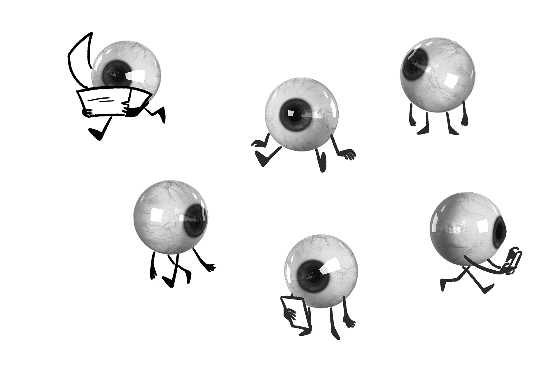
After viewing my initial concepts, my professor presented me with the challenge of not relying on pure illustration so much as a means of communication. I feel the decision to switch to using 3D models and reference images for my body parts helped to ground the images in more recognizable realism, while the inclusion of the small arms and legs helped retain some of the cute stylization from before.
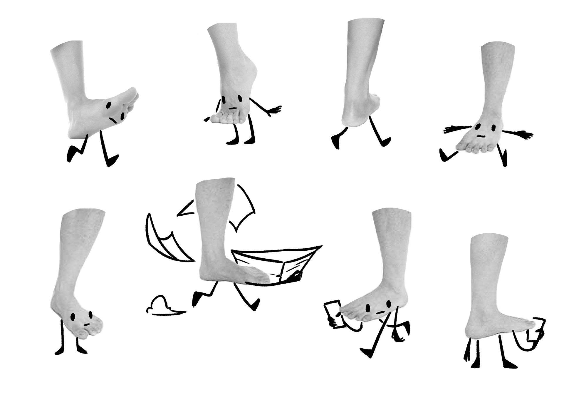
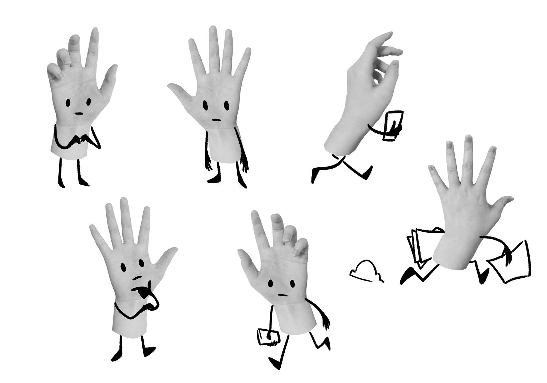
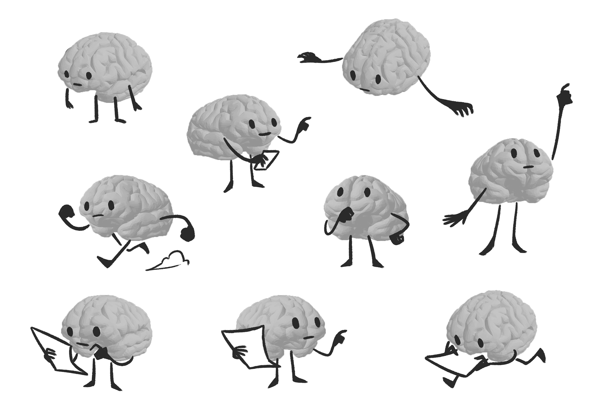
The minimal illustration also pushed me to use other means in elevating my spreads with a sense of depth, to truly give the feel of the busy office space that one's body is. This was done primarily by shifting scale and skewing text (aided by slanted parallelograms).
Ultimately this project served as a healthy exploration of integrating type and image, in a way that uses type itself as an element of an overall image, not to mention a small dose of learning the balance between stylization and concrete readability.